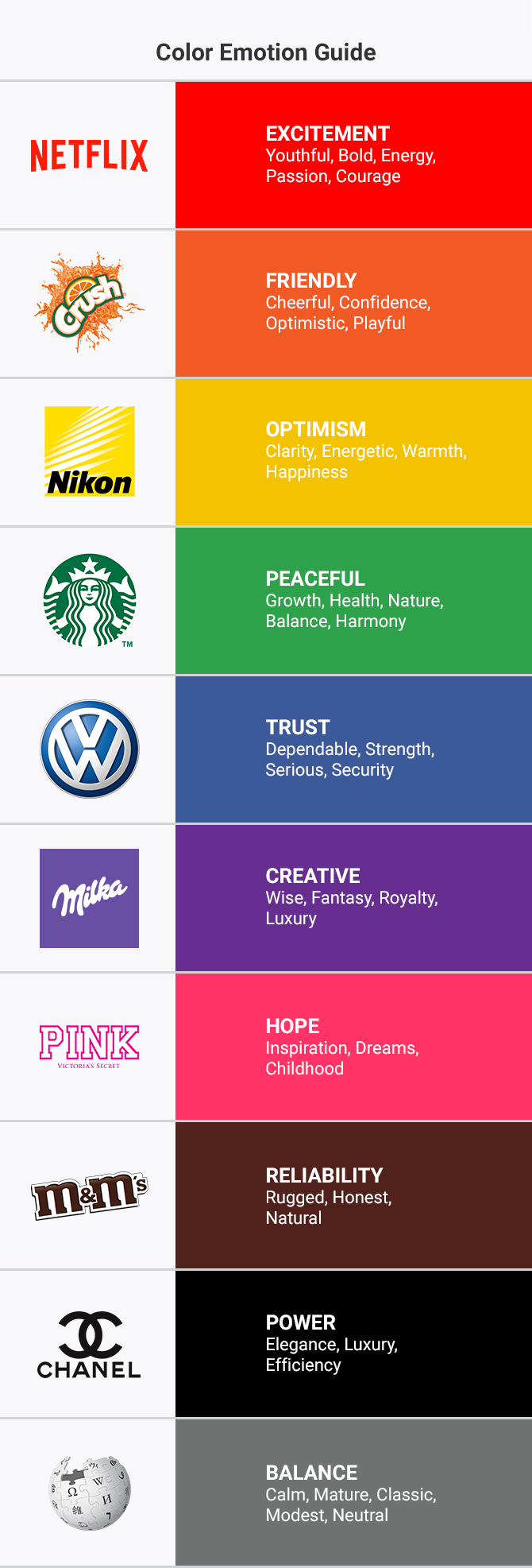
Colors play a powerful role in the world of branding. Choosing the right color palette can make a difference in how a brand is perceived and communicated. In this article, we will explore the importance of color palettes in branding and how they influence the way the audience perceives a company.
The Role of Colors in Branding
Colors are an integral part of a brand’s visual identity and serve various essential functions:
- Recognition: Colors can help a brand stand out from the competition and become easily recognizable. For example, the color red is often associated with Coca-Cola, while green is linked to Starbucks.
- Communication: The choice of colors can communicate emotions, values, and the brand’s personality. For instance, blue is often associated with trust and professionalism, while yellow can suggest joy and optimism.
- Consistency: A well-defined color palette contributes to maintaining visual consistency across all branding materials, from logos to websites, from packaging to advertising campaigns.
Psychology of Colors
Each color is associated with a psychology, and it’s essential to understand these connections when choosing colors in branding:
- Red can evoke passion, energy, or urgency and is frequently used in industries like food and retail.
- Blue is associated with calm, trust, and professionalism and is commonly used in financial and tech companies.
- Green suggests nature, sustainability, and growth and is prevalent in companies related to the environment or agriculture.
- Yellow represents joy, happiness, and optimism and is present in entertainment and food industries.
- Black communicates elegance, luxury, or mystery and is often associated with high-quality products.
Choosing a Color Palette
Selecting a color palette in branding is a strategic decision. Here are some essential steps to follow:
- Know Your Target Audience: Consider who your customers are and what colors might be familiar or appealing to them.
- Communicate Brand Values: Colors should reflect your brand’s values and personality.
- Study the Competition: Examine the colors used by your competitors to stand out.
- Test and Adapt: Experiment with various color combinations and collect feedback to optimize your choice.
- Maintain Consistency: Once you’ve defined your color palette, use it consistently across all branding materials.
Examples of Iconic Color Palettes
Some famous brands are recognized for their distinctive color palettes:
- Coca-Cola: Red is associated with a brand that spans generations, evoking energy and pleasure.
- Facebook: Blue conveys trust and connectivity, two key elements of the social environment.
- Starbucks: Green draws attention to nature and sustainability, aligning with the company’s approach to coffee.
- McDonald’s: Red and yellow create a sense of urgency and desire, encouraging customers to place quick orders.
In conclusion, the color palette in branding is a crucial element in communicating a brand. Colors influence the audience’s perception and can communicate emotions and values. Careful color choices can make a difference in creating a successful and recognized brand.


